Anna Agatat

Anna Agatat
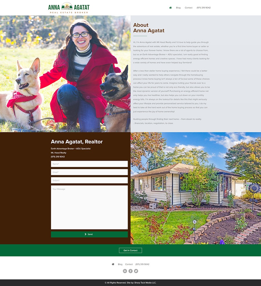
This project was completely built on WordPress was built from the ground up. It features a stunning design that boosted conversions by a significant margin. The main layout divides the page into 4 distinct sections so that readers can get a 4-way view of everything Anna's site offers. Although the site isn't very long, it's filled to the brim with information and visual queues which keep readers engaged and more likely to click on the call to action button, which we put into a horizontal section near the end of the page, which gives the page a distinct stop to where readers' eyes would naturally be drawn to the call to action button.
If you want to boost your business' conversion rates and increase incoming traffic, contact Sharp Tack Media for affordable web design services. We make sure that your company put its best foot forward when we present your company on the web.
