How To Make Brand That Make An Impact
Have you ever wondered why certain websites choose a strong use of color versus a lot of neutral space? Or maybe why some use buttons with sharp corners versus rounded ones? Unless you’re a designer, you probably haven’t put much thought into these small details. But these choices make up some of the most recognizable brands in the world. Custom design relies on principles built around what innately looks good to us and what attracts us.
 However small you think all of those seemingly insignificant design choices were, they most certainly aren’t. They’re made intentionally and serve a greater purpose: to communicate a brand’s identity to consumers. Here are some of the biggest design choices every brand has to make that we’ve gathered over years of designing brands for small businesses.
Sharp Vs. Round
We’ve seen a rather peculiar cycle in that every few years, we see a switch from sharp, rigid buttons and shapes, to rounded, more organic ones – and back again. While rigid shapes pair well with flat design, round shapes complement a more three-dimensional design language.
Using straight lines and sharp angles in your brand’s identity can help to convey that you mean business. Rounded silhouettes, on the other hand, can give off a friendlier, more appealing vibe. According to UXMovement, rounded silhouettes also tend to be easier on the eyes. The example below shows this phenomenon clearly: Because circles contain less information for our brains to process than other more complex shapes, they are easier to look at – especially at first glance.
Serif Vs. Sans Serif
Serif fonts have officially made a comeback, according to recent trends we’ve been seeing. That doesn’t mean sans serif fonts are out, though – they both have their place. Serif fonts are traditionally used in print, while sans serif fonts are easier to read on a screen. That doesn’t mean serif fonts are off-limits for digital or online businesses, however. Many brands use serif fonts strategically, incorporating them into short, bold headlines.
Commercial VS. Non-Commercial Photos
Imagery and visual elements are one of the most impactful aspects that shape a brand’s identity. The choice between commercial stock photography and a more organic or editorial look can change the entire tone of a brand. If you’re not sure of the difference between the two, commercial stock photography tends to appear more staged and idealistic, usually with smiling faces, while noncommercial imagery usually has an element of authenticity.
When selecting stock photography, it’s crucial that brands find appropriate imagery that lend visual cues to their mission, voice, and tone.
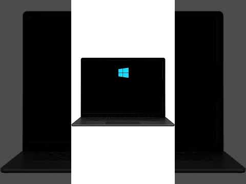
Color Vs. Whitespace
Whitespace refers to any use of negative space (white, black, or colored) that puts emphasis on a single product or selling point. We might be able to credit this trend to Apple, one of the first brands to popularize the minimalist design aesthetic. Whitespace works well for Apple because it highlights the simplicity of their sleek and innovative products in the tech space – but it isn’t for everyone. Take McDonald’s logo, for example. The all-conquering fast-food giant makes smart use of its negative space. From afar, the bright red color simply evokes feelings of hunger, but upon closer inspection, the golden arches make you want to enter into the establishment and purchase something.
Conclusion
Your website speaks your brand personality. By knowing the basics in the effective use of shapes, fonts, photos, and spaces, you can achieve your goal of designing a brand for success.